

Notes to Nodes
data visualization #1

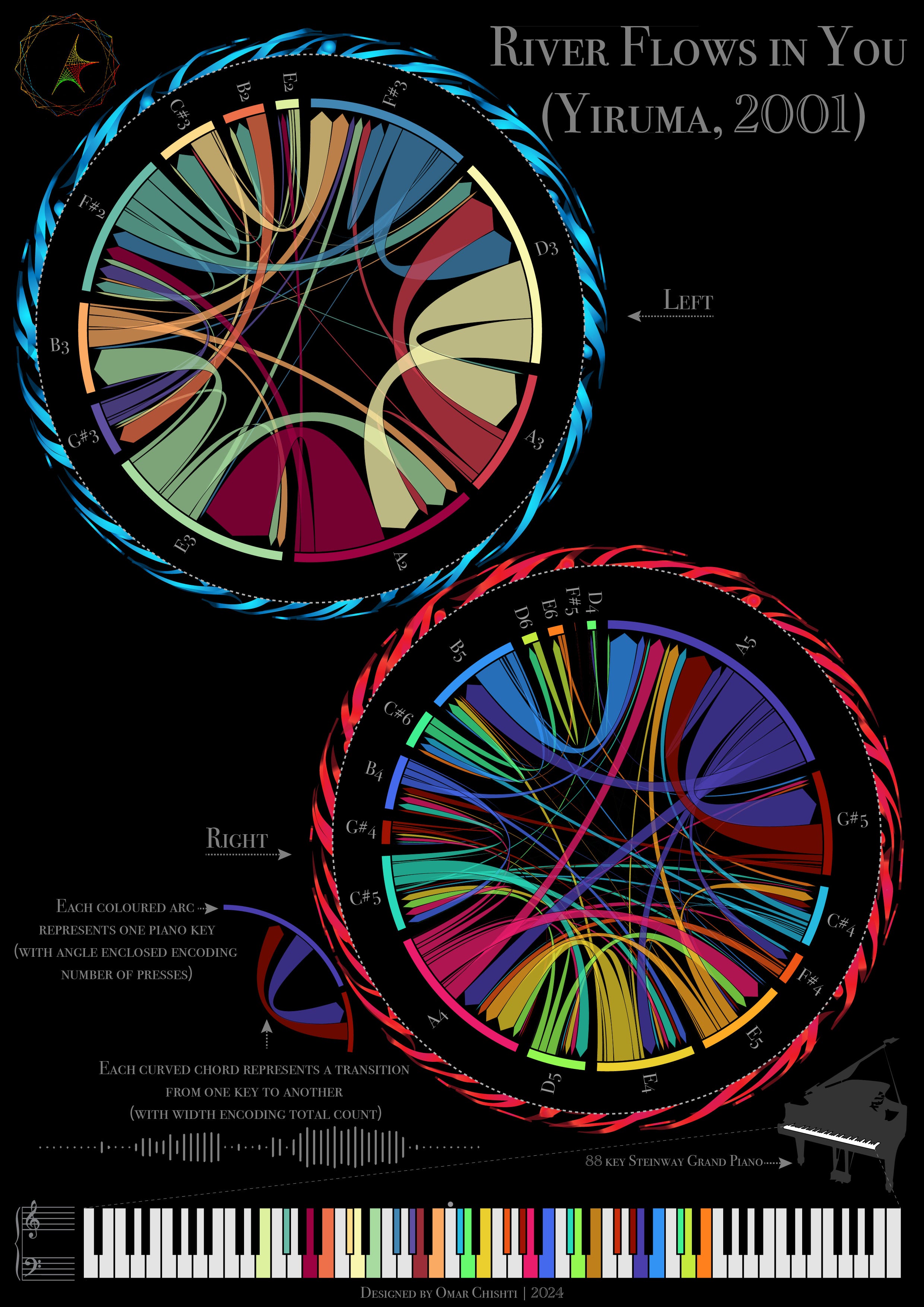
This piece depicts the networks traced by a pianist’s hands as Yiruma’s ‘River Flows in You’ is played. In the [somewhat unlikely, but always possible] case you’re unfamiliar, I highly recommend giving it a listen while you analyse the piece above: YouTube/Spotify. The Rousseau channel I linked has stunning neon visuals to accompany the rendition — they actually formed part of the inspiration to creating the piece. It is an exceedingly simple melody, but it has never failed to bring me peace.
Circograms or network chord diagrams are a neat way to visualise complex networks, and I first came across them while doing an undergraduate research project. The piece takes direct visual inspiration from my research on structural brain networks, where the strength of a cortical region’s connections to another is represented by edge width.
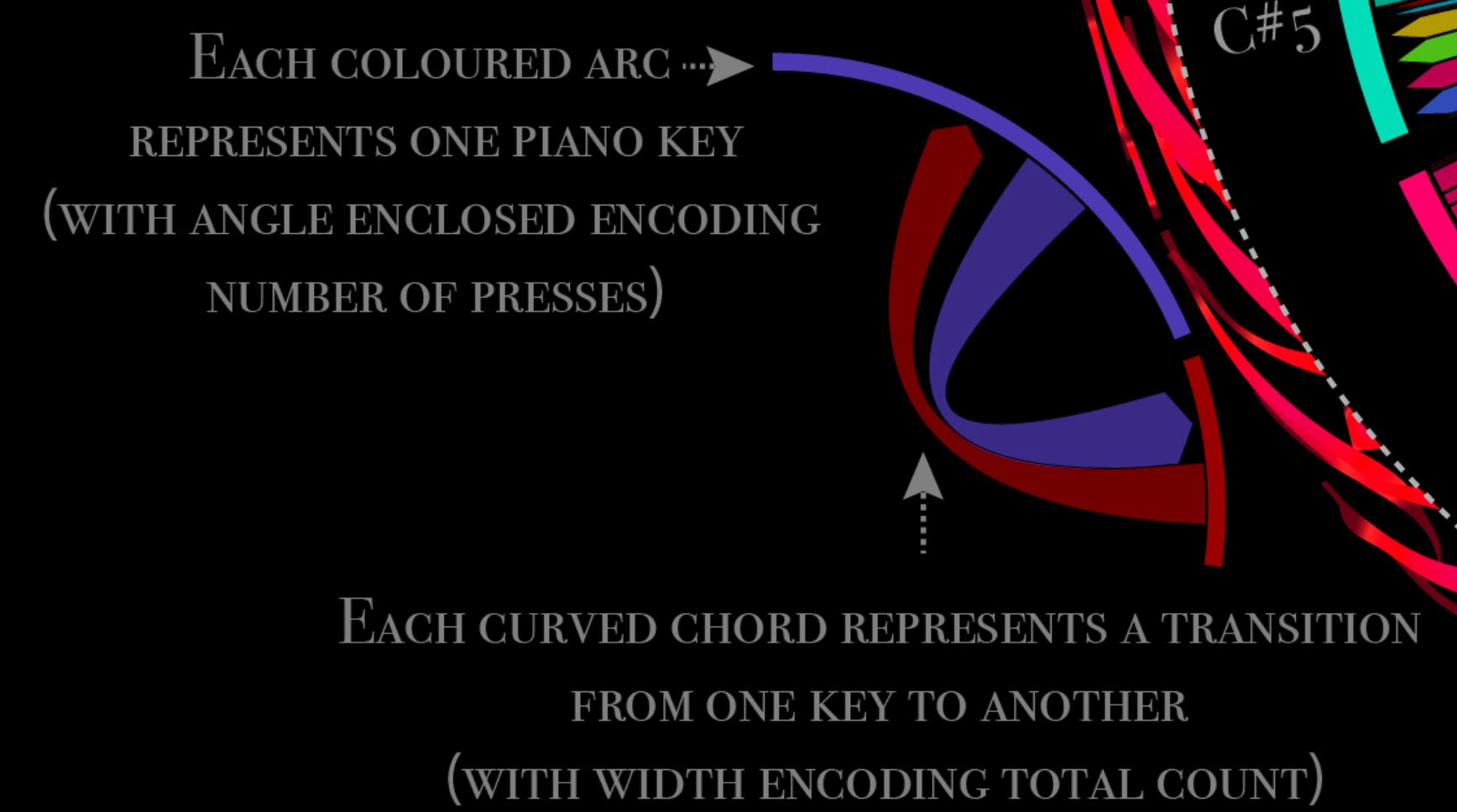
Each little segment on the outer border of the circogram represents a note, which is communicated via both colour and label. The note transition frequencies (here I mean the number of occurrences, not the sonic frequency) are encoded by the width of the directed arcs connecting different segments. The arcs between a given note pair (say A2 and E3) are asymmetric, since the number of transitions from A2 to E3 differs from the converse. If you’re interested in network analysis, this makes it a directed graph.
This decomposition is meant to provide a general feel for the sonic ingredients and their interplay. The circogram for the right hand is noticeably more intricate and more vibrant than the circogram for the left hand, which reflects the structure of the song. If you zoom out your perspective a bit, you might notice a superficial resemblance to a DJ turntable. I’ll leave the other visual easter eggs to your imagination.
People often ask me about the colours assigned to the notes. Although the implemented hues don’t reflect too much thought/design on my part, I did go on a whole quest to see if there was an ideal pairing. Newton actually divided the rainbow into VIBGYOR (seven colours) because he believed there should be correspondence between the colour spectrum and the musical scale. Unfortunately, the fact that visible light varies over one octave while audible sound varies over ten complicates any association schema. In the end I went with built-in colour maps and made some intuitive edits, which works well enough.
The dimension of time is collapsed and the precise order of notes/their duration/their loudness cannot be recovered from this particular depiction. I was tempted to add some extra features that would preserve more of the original tune’s information (like a radially arranged line chart to encode the average loudness of each note, and altering the radial extent of each note segment to reflect the duration for which it is played), but this seemed like a suitable end point for the static visualisation. I coded up an animated version that actually highlights the notes in real time while playing the song using simple sound synthesis — you can check it out on my personal website on a laptop by scrolling down, turning up the volume, and clicking anywhere on the image.
The 88 piano keys in the legend are colour-coded to match the note segments in the circograms – any keys/notes not in the song are left black/white, as they would appear on an actual piano. Each piano note has an associated MIDI number which helped make my programmatic analysis of the song considerably simpler. The MIDI (Musical Instrument Digital Interface) file format is a neat way to communicate music, used by electronic music instruments — 128 notes, their duration in ‘ticks’, the key velocity (i.e, loudness), and a few other aspects are neatly wrapped up in this standardised representation.
The code I wrote for this visualisation takes the MIDI file of the song as input, parses it, and converts it to a format suitable for network representation. This essentially involves moving from a sequential representation of the notes in the song to one that only captures the relationships between adjacent note pairs. I would love to go on a lengthy neuroscience tangent about how this parallels certain aspects of how we process music/sound, but I’ll refrain for now. I separated the song into two networks to bring out the mechanistic relationship to a pianist’s hands — which intrinsically translates to the two contralateral brain hemispheres whose networks inspired the whole thing! MIDI note number 60 (C4 or middle C) was set as the inflection point between hands. This is a hopefully forgivable simplification of how a pianist operates.
Once I had the network data in two tables with the right format (Note 1 | Note 2 | Count), I generated the circograms using RawGraphs. The Python libraries for circogram generation did not have the kinds of results I was looking for. I might be wrong, but I think notes are placed on the circogram in order of appearance, clockwise from 12:00. Finally, I went on to throw everything together into one cohesive whole using Adobe Illustrator. I have since mostly finished stitching the code together to be able to go straight from MIDI file to final visual, but somehow I feel automating the process entirely to pump out versions for all the classical pieces I like would take some of the soul out of it. Let me know if there are any in particular you’d be curious to see.
In the interest of concision (what concision?) I won’t go on about all the other little things behind and in front of this piece, but it is dear to me because it was the first from my data-driven art series and I am a somewhat sentimental person deeply attached to all my firsts.
I hope this write-up was helpful for understanding the technical details and creative process!
It's so lovely!